Design System
Design System is a powerful tool that helps you set up a thorough, end-to-end, fully configured design system with best practices and automation for your projects. With this tool, you are bound to save countless days if not weeks of setup time, allowing you to focus on delivering great products faster.
Aim
Creating reusable and modular components is no longer a challenge these days especially with tools like shadcn. But, the process of creating a proper industry level design system is an arduous and time consuming task. That is exactly our aim i.e. to streamline the design system setup to cater reusabilty, consistency, flexibility, modularity and scalability.
Reusability: A centralized component library ensures that the components are not just reusable inside 1 app but across multiple apps.
Consistency: Centralizing a piece of code always brings in consistency as long as the appropriate version is used everywhere.
Flexibility: Comes with TailwindCSS as the styling solution OOTB and due to it being a utility-first CSS framework, gives room to other styling solutions like StyledComponents, Emotion etc.
Modularity: Use/import the components as and when you need them. Each component can be used as a separate shared package inside a monorepo or can be published as a NPM package and be used as a dependency in a different (apps) repository. Create headless and modular components with tools like radix-ui, headless ui etc.
Maintainability: Even when your projects expand and become more complex, your component library remains coherent and managable. Tools like Nx and the concept of workspaces makes it extremely easy to maintain a design system codebase.
Tools and Technologies
The generated design system will come with the following tools/technologies configured out of the box:
- Nx v19 for easy workflow and project management i.e. automatic versioning, changelogs and releases
- Storybook v8 for design system and UI library documentation
- TailwindCSS as the styling option
- Radix UI for creating custom component library
- Chromatic for storybook deployment, visual testing and reviewing
- Tailwind Config Viewer for token visualization
- CVA, Tailwind Merge for writing manageable and scalable components
- SVGO and SVGR for optimized svg components
- Hygen for building components, hooks, pages etc on the fly
- Vite v5 for building storybook and Tsup for ui components and packages
- clsx and tw for efficiently constructing tailwind classes
- Husky to enhance the git workflow and lint-staged to run linters against staged git files
- eslint v8, prettier, stylelint, commitlint, commitizen etc. to ensure the best practies and help you keep the code consistent
This is a highly opinionated tool. Learn more about customization options.
Headless Component Provider
As this is just a boilerplate provider, you will only get a couple of sample UI components built on top of radix-ui. You can use any other alternate headless component libraries like:
You can also use components from libraries like:
Base Styling Solution
TailwindCSS is a highly configurable tool, so replacing it with an alternative solution can be a bit tedious. Tailwind classes are used in the sample components, Storybook, and are exported via its own shared package, which is then used in the root tailwind.config.cjs.
The recommended alternatives are:
You can also go for the popular css-in-js libraries:
Removing Tailwind means removing the tailwind config viewer. You will then need to look for an alternative for token visualization.
Chromatic
Chromatic is the recommended tool for Storybook deployment as it is specifically designed for Storybook. It includes a suite of automated collaboration tools that help you ship UIs faster. With seamless integrations with Storybook, continuous integration services, and Git, you will spend less time on operations. If you want to know why you should deploy Storybook or how it compares against other services, then click here.
Docs App
If you prefer a documentation app separate from Storybook, you can use one of the following Static Site Generators (SSG) that offer built-in support for MDX:
- Docusaurus - A popular choice for creating documentation websites
- Nextra - A Next.js-based SSG
- Astro - A modern SSG that supports multiple frameworks
- Vitepress - A Vite and Vue powered SSG
Usage
Install the package globally by running:
npm i -g @genesisx/design-system@latestGo to the directory where you want to create a design system and run the below command:
dsProvide inputs to the prompts. Following the questions asked:
- What is your ui design system going to be called? (scoped name is recommended)
- Do you want to provide an additional prefix? (applicable only for scoped naming conventions)
- Choose your package manager (pnpm or yarn is recommended)
When you run the cli, you will see some instructions logged on your terminal. If you are not sure about scoped names or prefixes, then click on this to read the complete block.
Component Naming Conventions
When you generate a design system using this tool, the components provided will automatically be renamed to incorporate your specified package name and prefix. This ensures a consistent and unique naming convention across your design system.
Example Scenarios
Scoped Library:
- Design System Name: @my-org/design-system (the name property in your root
package.json) - Prefix: react-tw (not mandatory)
- Resulting Component Name: @my-org/react-tw-button
- Explanation: If you have a button component, it will be renamed to include both the package name and the prefix, resulting in @my-org/react-tw-button.
- Design System Name: @my-org/design-system (the name property in your root
Regular Library:
- Design System Name: my-ui-kit (the name property in your root
package.json) - Prefix: (not applicable)
- Resulting Component Name: my-ui-kit-button
- Explanation: If you have a button component in a regular (non-scoped) library, it will be renamed to include just the package name, resulting in my-ui-kit-button.
- Design System Name: my-ui-kit (the name property in your root
Understanding the Renaming Process
- Scoped Libraries: Scoped libraries use a naming convention that includes the organization name and the design system name, providing clear context and avoiding naming conflicts across different projects or organizations.
- Regular Libraries: Regular libraries use a simpler naming convention that includes only the design system name, making it straightforward and easy to understand.
Benefits of Naming Conventions
- Consistency: Ensures all components follow a consistent naming pattern, making it easier to identify and use them.
- Uniqueness: Prevents naming conflicts by incorporating unique package names and prefixes.
- Clarity: Provides clear context about the origin and purpose of each component, especially in larger projects with multiple libraries.
You are free to use your own naming convention. Make sure you are doing a
Find AllandReplace Allwhen changing from one name to another.
If you're about to start a new project, consider the following options to make an informed decision. Each approach offers different benefits and trade-offs based on your project's needs.
Independent Design System Setup: Use the tool to build an independent design system. You can then publish the UI components to NPM (or the registry of your choice) and install them in other repositories (monorepos) where your applications reside.
Pros:
- Modularity: Allows you to use the design system across multiple projects and repositories.
- Versioning: Easier to manage and control versions of the design system components.
- Separation of Concerns: Keeps the design system isolated from application-specific code, leading to cleaner and more maintainable projects.
Cons:
- Dependency Management: Ensuring all projects are using the correct version of the design system can be challenging.
Monorepo Setup: Use the tool to create a design system. You can then start creating react or nextjs apps using react-archetype in the same repository.
Pros:
- Centralized Management: All code (design system and applications) is in one place, simplifying dependency management and development workflows.
- Consistency: Ensures that all applications use the same version of the design system components.
- Shared CI/CD: Unified continuous integration and deployment pipelines can be set up for the entire monorepo.
Cons:
- Complexity: Monorepos can become complex to manage as the number of projects grows.
- Build Times: Larger codebases results in longer build and test times.
Folder structure
Within the polyrepo app, you will find a range of project files that serve various purposes and contribute to the overall structure and functionality of your application. These files are designed to simplify development and ensure the smooth operation of your polyrepo architectures.
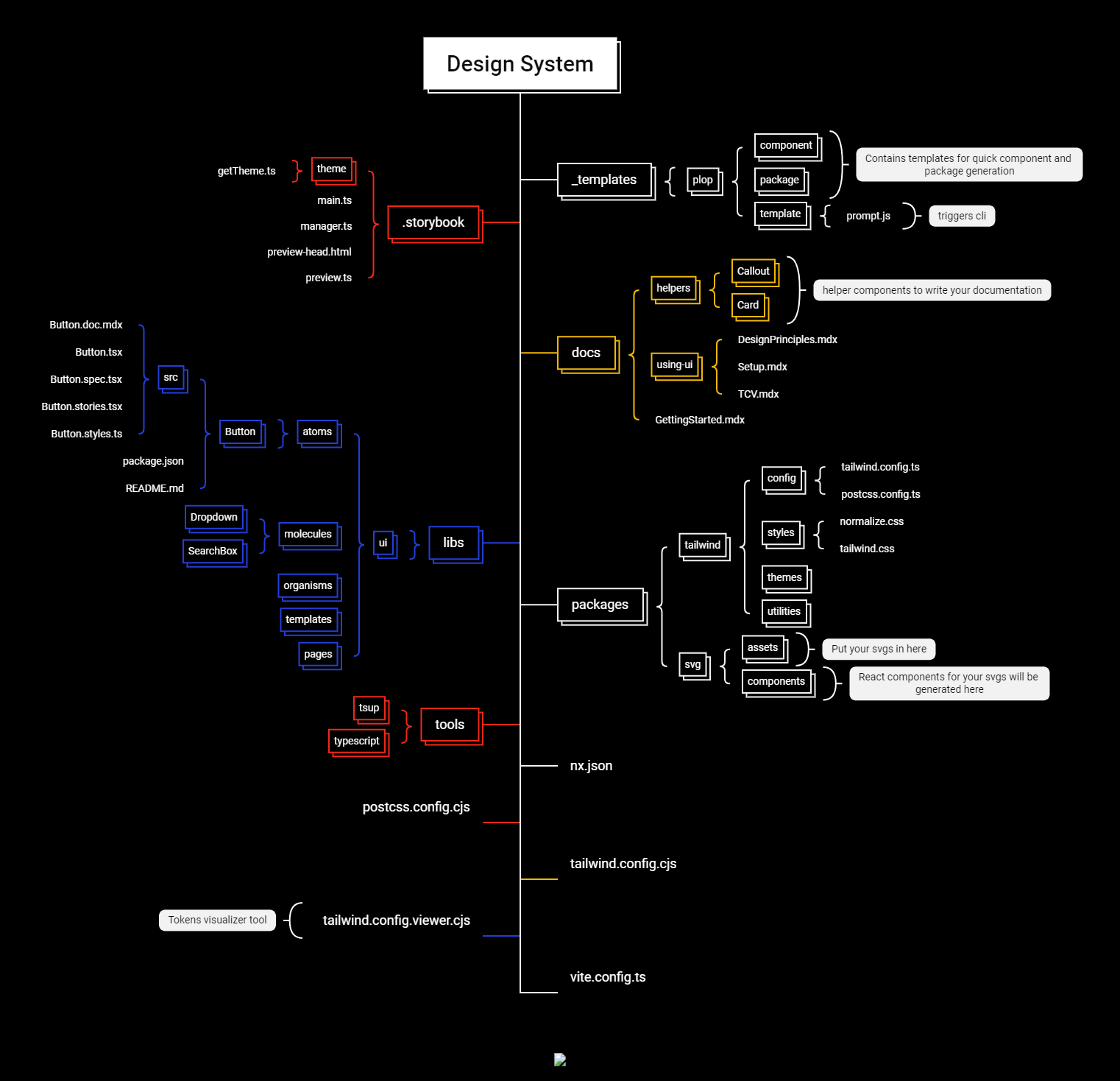
(Click on the image to see it in a new tab)
Documentation
There are 3 components to the documentation provided:
Storybook
Storybook is a must-have tool as it provides a convenient environment for building, testing, and documenting components, making it easier to create robust and reusable elements. With this tool, you will get an advanced Storybook setup that is fully configured not only to document your components but also to support comprehensive project documentation.
In .storybook, you will get a theme/getTheme.ts which gives you the option to fully customize and rebrand the storybook app to make it look just like your other apps. You can make use of the CSS Variables created in tailwind.css file and pass it to the computeStyle function as follows:
colorPrimary: computeStyle("--color-primary"), // using css vars
// OR
colorSecondary: '#fff', // using hex
Visit Storybook's Theme quickstart or Theming Types for more information on the available options.
Other than the main.ts, you will also get a manager.ts file where you can manage your Storybook UI layout and a preview.tsx file to control individual story's layout
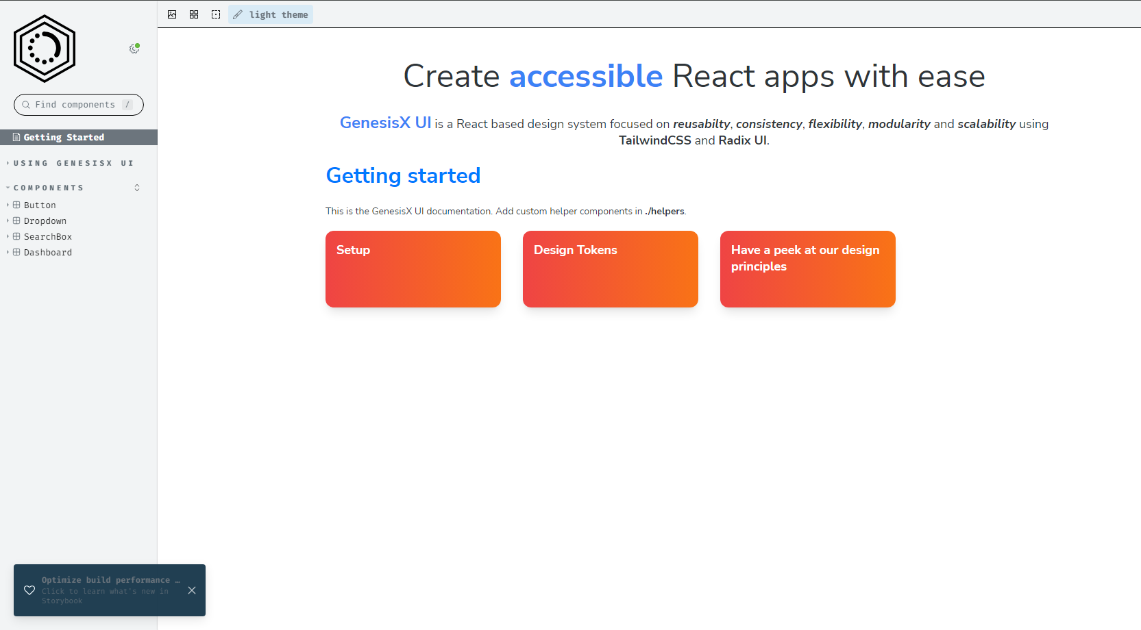
Docs App
As part of your design system, you will get an MDX-powered docs app inside the docs directory. This can be used to document your design system, UI components, design tokens, best practices, guidelines, etc. The docs app comes with two helper components: Callout and Card. You can add more such helpers to make your documentation more appealing and easier to work with. The mdx files added in the docs app will be picked up by Storybook when it is spun up.
Adding `remark` or `rehype` Plugins to Storybook
- Install the Plugin
- Update Storybook Configuration.storybook/main.ts
//...
{
  name: '@storybook/addon-docs',
  options: {
    mdxPluginOptions: {
      mdxCompileOptions: {
        // Add the installed remark plugins
        remarkPlugins: [remarkGfm],
        // Add the installed rehype plugins
        rehypePlugins: [],
      },
    },
  },
},
//... - Restart Storybook
The docs app uses remarkGfm for enhanced Markdown support. To add more power, you can refer to the following links and add plugins based on your use case:
To understand how remark and rehype work, you can refer to this guide.
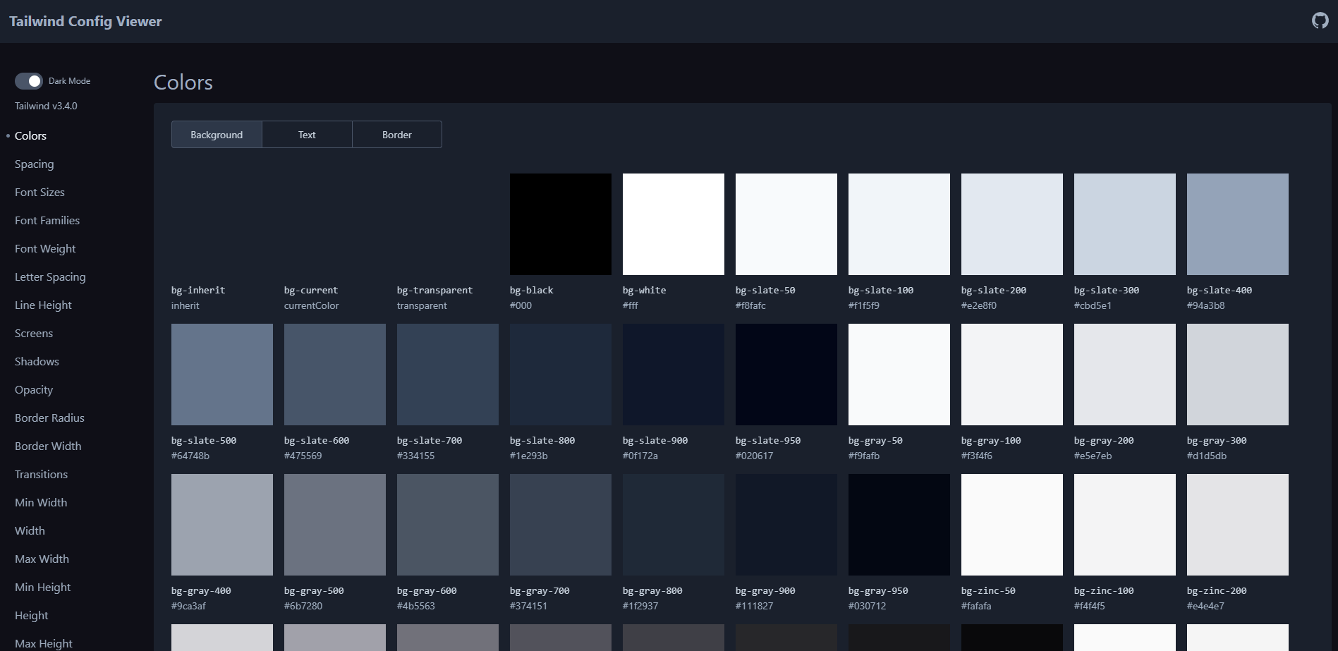
Tailwind Config Viewer
Tailwind Config Viewer is a local UI tool for visualizing your Tailwind CSS configuration file.
It is an optional component for your documentation. The docs app contains a TCV.mdx file where your tailwind-config-viewer is embedded using an iframe.
Run and Build Documentation
To run Storybook parallel to tailwind config viewer, use:
npm run sbtcv
Once the server is up and running, you can access Storybook by opening your web browser and navigating to http://localhost:6006.
You can build the static files for production by running the following command:
npm run build:storybook
To keep tailwind config viewer separate from the docs, click here
Remove
TCV.mdxfile from the docs app.Use the following commands to spin up storybook and tcv:
npm run storybooknpm run tcvChange the following script in your root
package.jsonfile:"build:storybook": "storybook build -o ./dist/storybook",Deploying tailwind config viewer is not necessary but if you want to, you can do that just like any other static app and add a new CD job for the same.
Template Generator
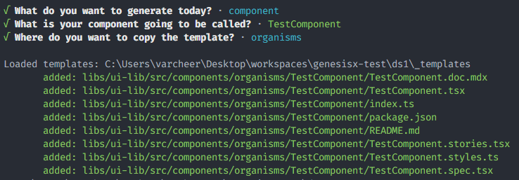
Design System comes equipped with template generator engine like Hygen to speed up your component/package generation process.Try running the below command to start execute the cli tool:
npm run generate

As part of this, you will get a __templates directory which contains all your templates and prompts. In __templates, you will have a plop directory which further contains 3 sub-directories, namely: template, component and package. template contains a prompt.js which is where the generate command will go to when executed. template will then take the flow to either the prompt.js file of component or package based on the input provided.
generate underneath runs the following command:
npx hygen plop template
Here, plop is the directory name inside __templates, and tempate takes it to the prompt.js in plop/template directory. If you want to add more such templates, follow the below steps:
Create a new directory inside
plop, let's call itnewGen. So, it will be as_templates/plop/newGen.Add all the necessary template files ending with
.ejs.tinside the newly created directory with appropriate path to be copied at.---
to: path/to/<%= newGen %>/index.js
---
console.log('Hello World');Create a
prompt.jsfile with the required prompts.module.exports = [
{
type: "input",
name: "newGen",
default: "default",
message: "What is your newGen going to be called?",
},
];Add an additional object in the choices array in
_templates/plop/template/prompt.jschoices: [
{ name: "component", message: "A new component" },
{ name: "package", message: "A new package" },
{ name: "newGen", message: "A new generator" },
], // add more based on your requirement
Component library
In libs/ui, you will find a starter ui kit with some sample components OOTB. This library follows the ATOMIC design principle to segregate and organize the ui components.
New Component
To generate a new component, run:
npm run generate
Select A new component, provide the component name and the directory (atoms, molecules, organisms, templates) where you want it to be added.
Packages
In your packages directory, you will be provided tailwind and svg package.
Tailwind
This package contains 4 sub-directories, namely: config, styles, themes and utilities.
config- contains the basetailwindandpostcssconfig files. You can put all the necessary tailwind configuration here which you would need across all your apps.styles- comes withnormalize.cssandtailwind.cssfiles.normalize.cssis the css reseter whiletailwind.csscontains the standard tailwind imports and your other design variables.utilities- place where you will create your tailwind utilites.
SVG
This package provides support to convert the SVG files into react component. It uses svgo to optimize the sbg files and svgr to convert the optimized svg into a react component.
The react components can be imported in other apps through named import. Tree shaking is enabled in this package.
The recommended way of using small and medium size SVG is to optimize the svg and convert them into a react component.
But in case you are working with large number of SVG files or massive SVG files, it is recommended to host the optimized SVG files on some object store or CDN. To use the SVG hosted on CDN, we can fetch the url of the svg on CDN and then use it inside our react component. One such example is shown here https://github.com/Paul-Ayanava/cdn-svg-react-example .
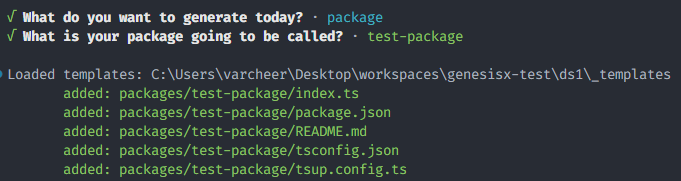
New package
To create a new package, run:
npm run generate
Select A new package and provide the package name.
By default, the ui library and packages are set up to be built and published to npm i.e. when design system is initialized, the build process for all the ui components and the packages are run by the cli. This setup is useful if you want to keep the design system and your applications in separate repositories.
However, if you prefer to keep the design system and your applications within the same monorepo, you do not need to build and publish the packages separately. Instead, you can leverage the benefits of workspaces. To do this, delete the dist folder and adjust the main and exports keys in all package.json files to point to the actual .ts files instead of dist/*.js.
To learn more, check out this link.
Tailwind and PostCSS setup
To use tailwind in your apps, follow the below steps:
Install your published package or add
<tailwind-package-name>in your app's devDependencies manually:apps/my-app/package.json// only if your design system is in the same repo (monorepo)
{
"devDependencies": {
"<tailwind-package-name>": "*",
//...
}
}You will have to have to create
tailwind.config.cjsandpostcss.config.cjsfiles in your app where you want to use tailwind.In
tailwind.config.cjs, add the following snippet:tailwind.config.cjsconst { tailwindConfig } = require('<tailwind-package-name>/config');
module.exports = {
presets: [tailwindConfig],
content: [
...tailwindConfig.content,
// add this only if you are installing your ui component rather than using the symlinked version
'../../node_modules/<scopeName>/**/**/index.js'
// use "../../node_modules/<ui-component-name>/dist/index.js" if you are NOT working with scoped names
],
};In
postcss.config.cjs, add the following snippet:postcss.config.cjsconst { postcssConfig } = require('<tailwind-package-name>/config');
module.exports = postcssConfig;Import
tailwind.cssin your app root (main.tsx or _app.tsx etc):/src/_app.tsximport '<tailwind-package-name>/styles/tailwind.css';
// ...Now, you should be able to use tailwind classes in your apps.
If you have custom CSS to add, create the necessary CSS file(s) and import these files at the very top of a global CSS file, followed by any other styles.
Let's say you have the following css files in your app: - src/styles/header.css - src/styles/footer.css - src/styles/main.cssYou can create a new file called
tailwind.cssin yoursrcdirectory and import the CSS files as follows:/src/tailwind.css/* css file exported from the package */
@import '<tailwind-package-name>/styles/tailwind.css';
/* Your local css files */
@import "./styles/header.css";
@import "./styles/footer.css";
@import "./styles/main.css";
/* Your custom styles if any */
body {
background-color: #f0f0f0;
}Finally, go to your _app.tsx file or the root file and import the following:
/src/_app.tsximport './tailwind.css';
Other Scripts
Build
To run the build script present in all your workspaces (this does not include storybook and tcv):
npm run buildRelease
Releases are equivalent to publishing the packages to NPM and this process is delegated to Nx.
First release:
# dry running first release
npm run release:d --first-release

# first release
npm run release --first-release
Subsequent releases:
# dry running releases
npm run release:d

# release
npm run releasedangerThe --dry-run option is useful for testing your configuration without actually creating a release. It is recommended to run release once with --dry-run first to ensure everything is configured correctly.
Configure Custom Registries
To publish JavaScript packages, Nx Release uses the npm CLI under the hood, which defaults to publishing to the npm registry (https://registry.npmjs.org/). If you need to publish to a different registry, you can configure the registry in the .npmrc file in the root of your workspace or at the project level in the project configuration.
/.npmrcregistry=https://my-custom-registry.com/
//my-custom-registry.com/:_authToken=${REGISTRY_AUTH_TOKEN}The above configuration makes sure that, all your packages will be published as part of the same organization.
If for some reason you are working with multiple scopes in the same repository, then here is an example:
/.npmrcregistry=https://registry.npmjs.org/
@my-org:registry=http://my-custom-registry.com/my-org
//my-custom-registry.com/my-org:username=admin
//my-custom-registry.com/my-org:_password=${BASE64_PASSWORD}
@my-org1:registry=http://my-custom-registry.com/my-org1
//my-custom-registry.com/my-org1:_authToken=${REGISTRY_AUTH_TOKEN}
email=<test@user.com>
Refer the below resources for more information:
Commit
As commitizen is configured to form conventional commits, use the following to make any commits:
npm run commit